Plotting Your Data
After we’ve restricted and sorted our data (if needed), it’s time to actually make some plots! For the most part, the code is designed to make plots work automatically without needing to know too much about the kinds of possible variables, but see More Advanced Plotting for more details.
Variable Types
The variable types are any of the numbers created in your metadata, the sightline position specifications “r”, “theta”, “phi”, and all ions tracked in run_sightlines. There are also what are called gasbins. These refer to the fraction of a particular species which is found in cells of a particular type along a sightline. For example, if you have distinguished between cold gas (T<10^3.8 K), cool gas (10^3.8 K<T<10^4.5 K), warm-hot gas (10^4.5 K<T<10^6.5 K), and hot gas (10^6.5 K<T), then you might want to know which of those bins contained most of your “O VI”. This fraction is stored in the sightline. To access it, the variable name follows the format: <ion>:<bin_type>:<bin_name>. In this case, we will use the variable O VI:temperature:cool.
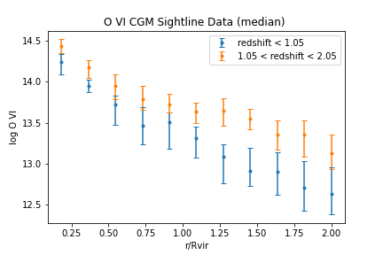
Plotting Errorbars
To plot errorbars, you give an x and y variable, as well as an (optional) “lq” object. There are thus three dimensions to this graph, where the third dimension is the color sorted by. For example:
mq = quasarscan.create_mq()
mq.constrain_current_quasar_array('simname',['VELA'])
lq = mq.sort_by('redshift',[0,1.05,2.05])
mq.plot_err('O VI','rdivR',lq=lq)
You can also pass a list of multiple y variables. In that case, you cannot use an lq object because each variable will have a different color.
The list of keyword arguments for plot_err is shown here:
yVar:
stringorlist, yVar or yVars to usexVar=’rdivR’:
string, xVar to useqtype=’sim’:
string, by default plot simulations, but can also plot observations or empty datasets (see More Advanced Plotting).average = ‘default’:
stringortuple, by default uses the averaging function defined increate_mq, otherwise uses whichever is given here. Options are ‘mean’,’median’,(‘median’,<percentiles to show>), (‘covering_fraction’,<cutoff in cm^-2>)force_averaging=False:
boolean. Only used ifqtype='sim'. Forces averaging lines as normal, disregarding uncertainties.logx=’guess’:
stringorboolean, if True plot will use logarithmic x axis, if False will use linear axis. If “guess”, will use axis depending on variable and common usage.logy=’guess’:
stringorboolean, if True plot will use logarithmic x axis, if False will use linear axis. If “guess”, will use axis depending on variable and common usage.title=None:
string, if given replace the automatically generated title with new oneoffsetx=False:
booleanornumberortuple, if True, separate each point in x space so that vertical errorbars don’t overlap. If a number is given, add that constant to all x values.tolerance=1e-5:
float, how close values need to be to be combined together, inx’s units. (so that slight floating point errors do not separate values). Make this number larger to show fewer errorbars, farther apart in xax=None:
matplotlib.Axis, if not None, add plot to this axis. If None, generates a new axis.fig=None:
matplotlib.Figure, if not None, add plot to this figure. If None, generates a new figure.dots=False:
boolean, if True, replace errorbars with dots. Errors are thus not shown.grid=False:
boolean, if True, show grid underneath datalinestyle=’’,``string``, connecting line between errorbars. Options include ‘-’ (solid line), ‘–’ (dashed line), ‘.’ (dotted line).
ls=’’,``string``, alias for
linestylelinewidth=1.5,``float``, size of connecting lines (if
linestyle!='')fmt=None,``string``, format of errorbar origin points. Default is dot for median values, none for mean. Options include ‘o’ (dot), ‘*’ (star), ‘s’ (square), etc.
coloration=None,``list`` of colors to use for different errorbars. Default is matplotlib default colorwheel
xlims=’default’,``tuple`` low, high x limits for graph
ylims=’default’,``tuple`` low, high y limits for graph
markersize=’default’,``float`` size of markers
alpha = 1.0,``float`` transparency of plot (1.0 = nontransparent, 0.0 = invisible)
elinewidth=None,``float`` linewidth of errorbars
capsize=3,``float`` horizontal line length of errorbars
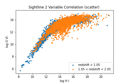
Plotting Scatter Plots
You can also plot the sightlines individually as points. This is especially useful when both the x and y coordinates are continuous parameters that vary with each sightline. The three dimensions are the same, i.e. the third dimension is the sorting color.
mq = quasarscan.create_mq()
mq.constrain_current_quasar_array('simname',['VELA'])
lq = mq.sort_by('redshift',[0,1.05,2.05])
mq.plot_scatter('O VI','H I',lq=lq)
The full list of keyword arguments for plot_scatter is here:
yVar:
stringorlist, yVar or yVars to usexVar=’rdivR’:
string, xVar to useqtype=’sim’:
string, by default plot simulations, but can also plot observations or empty datasets (see More Advanced Plotting).logx=’guess’:
stringorboolean, if True plot will use logarithmic x axis, if False will use linear axis. If “guess”, will use axis depending on variable and common usage.logy=’guess’:
stringorboolean, if True plot will use logarithmic x axis, if False will use linear axis. If “guess”, will use axis depending on variable and common usage.title=None:
string, if given replace the automatically generated title with new oneoffsetx=False:
booleanornumberortuple, if True, separate each point in x space at random, for discrete data.ax=None:
matplotlib.Axis, if not None, add plot to this axis. If None, generates a new axis.fig=None:
matplotlib.Figure, if not None, add plot to this figure. If None, generates a new figure.grid=False:
boolean, if True, show grid underneath datafmt=None,``string``, format of errorbar origin points. Default is dot for median values, none for mean. Options include ‘o’ (dot), ‘*’ (star), ‘s’ (square), etc.
coloration=None,``list`` of colors to use for different errorbars. Default is matplotlib default colorwheel
xlims=’default’,``tuple`` low, high x limits for graph
ylims=’default’,``tuple`` low, high y limits for graph
markersize=’default’,``float`` size of markers
alpha = 1.0,``float`` transparency of plot (1.0 = nontransparent, 0.0 = invisible)
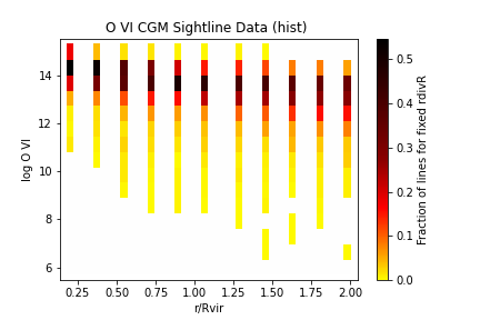
Plotting 2d Histograms
You can also see how sightlines fill in a 2D histogram. In this case, color represents “number of sightlines in bin” and so only two variables are possible, rather than 3. This works best with discrete data points, such as impact parameter, rather than continuous points.
mq = quasarscan.create_mq()
mq.constrain_current_quasar_array('simname',['VELA'])
lq = mq.sort_by('redshift',[0,1.05,2.05])
mq.plot_hist('O VI','rdivR',lq=lq)
The full list of keyword arguments for plot_hist is here:
yVar:
stringorlist, yVar or yVars to usexVar=’rdivR’:
string, xVar to uselogx=’guess’:
stringorboolean, if True plot will use logarithmic x axis, if False will use linear axis. If “guess”, will use axis depending on variable and common usage.logy=’guess’:
stringorboolean, if True plot will use logarithmic x axis, if False will use linear axis. If “guess”, will use axis depending on variable and common usage.title=None:
string, if given replace the automatically generated title with new oneax=None:
matplotlib.Axis, if not None, add plot to this axis. If None, generates a new axis.fig=None:
matplotlib.Figure, if not None, add plot to this figure. If None, generates a new figure.weight=True,``boolean``, if True, normalize each discrete x position, if False, make 2D histogram which may have more total lines in outer impact parameters.
bar_type=’HotCustom’,``string`` colorbar to use. Options for now are ‘HotCustom’,’RainbowCustom’, and ‘BlackandWhite’
cbarlabel=None,``string`` if given, replace colorbar label with this label
ns = (42,15),
tuplenumber of bins to split space into.